• The Marketing Ladder: How to Turn Engagement into Revenue (Step by Step)

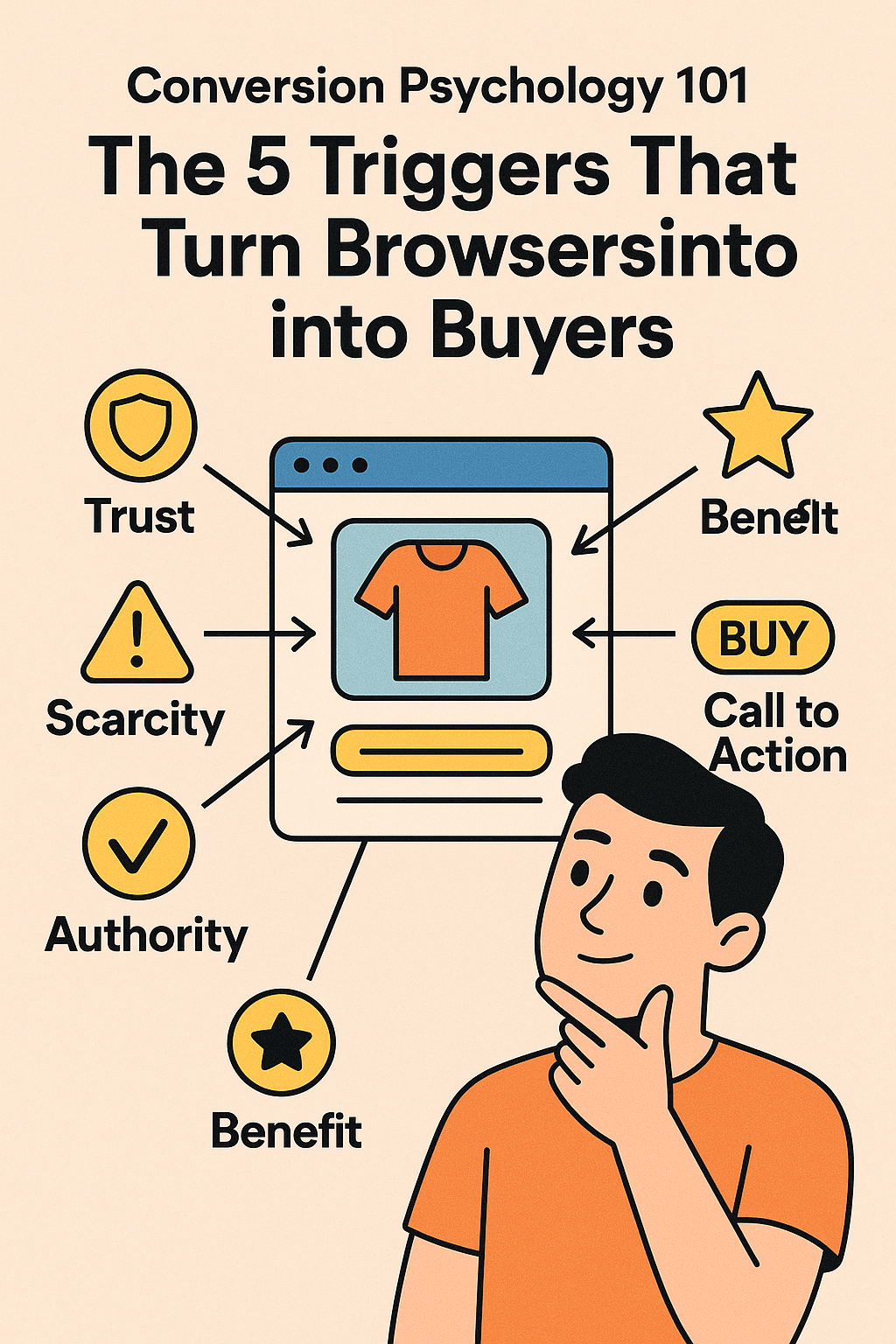
    You’re doing the social media thing. You’re posting content. You’re getting likes, comments, maybe even shares. Your engagement is up. Your followers are growing.

    And your revenue? Still stuck.

    Here’s the problem: you’re collecting followers like they’re Pokémon cards, but you’re not moving them up the ladder. Engagement without a path to purchase is just expensive entertainment.

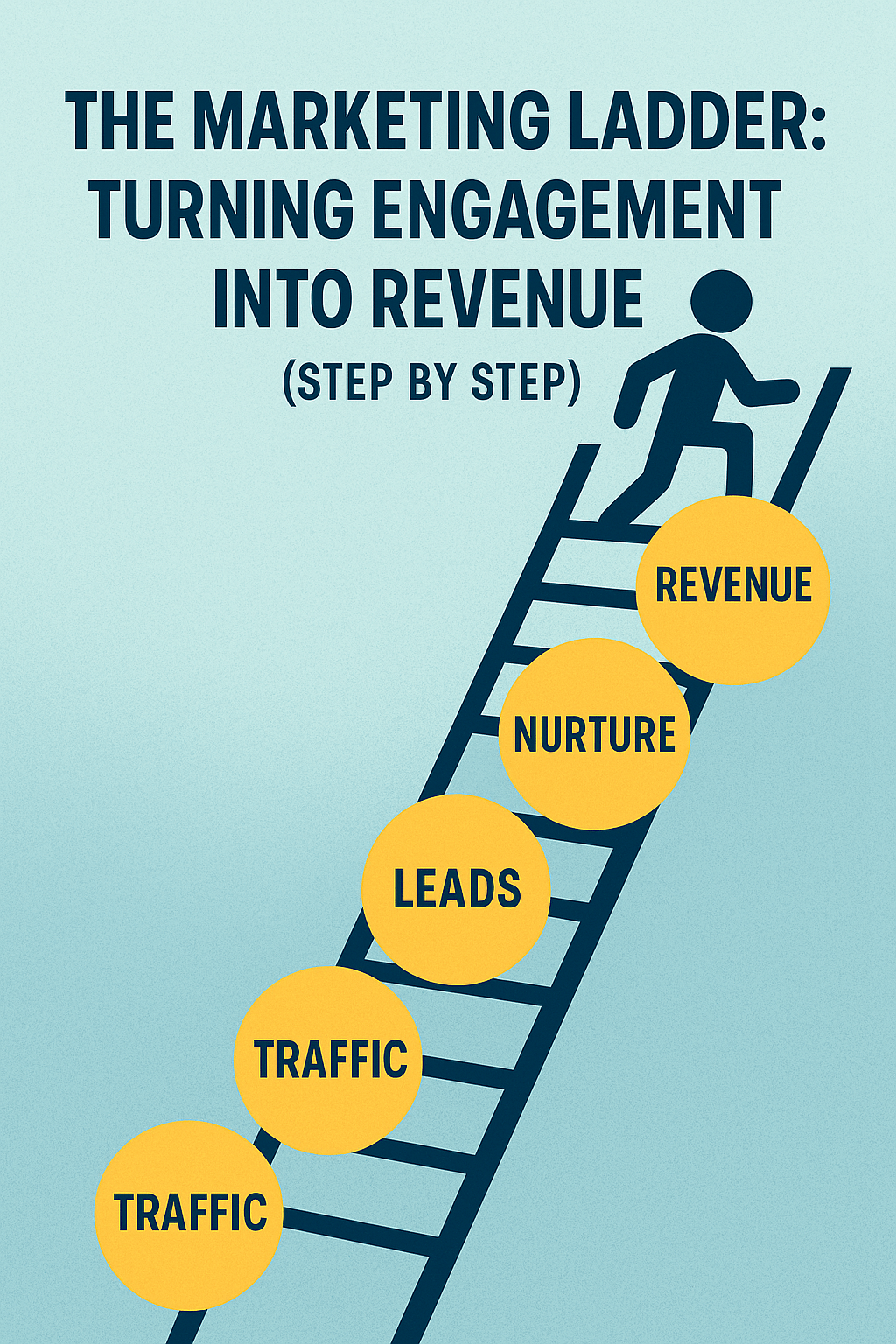
    The Marketing Ladder is your step-by-step system for turning casual followers into paying customers. Not through manipulation or aggressive sales tactics, but through a strategic progression that builds trust and demonstrates value at every rung.

    What Is the Marketing Ladder?

    Think of your marketing funnel as a ladder. Each rung represents a deepening level of engagement and commitment. People enter at the bottom with minimal investment (following you on social media) and climb upward until they reach the top: becoming paying customers and, eventually, repeat customers or advocates.

    The key insight: most people won’t jump from the bottom rung to the top in one leap. You need to build intermediate steps that feel natural, low-risk, and valuable on their own.

    Here’s what the ladder typically looks like:

    Rung 1: Awareness (they know you exist) Rung 2: Interest (they follow or subscribe) Rung 3: Engagement (they consume your content) Rung 4: Conversion (they become a lead) Rung 5: Transaction (they become a customer) Rung 6: Loyalty (they buy again) Rung 7: Advocacy (they refer others)

    The problem most small businesses have? They’re trying to get people from Rung 1 to Rung 5 in one ask. “Hi, stranger! Want to buy my $2,000 service?”

    Rung 1: Awareness (Getting on Their Radar)

    Before anyone can climb your ladder, they need to discover it exists.

    Awareness is about being visible where your ideal customers already spend time. This isn’t about being everywhere—it’s about being in the right places with the right message.

    Tactics that work:

    • SEO-optimized content that answers specific questions your prospects are searching for
    • Strategic social media presence on 1-2 platforms where your audience actually is (not all of them)
    • Guest appearances on podcasts, blogs, or YouTube channels your audience follows
    • Strategic partnerships with complementary businesses
    • Targeted paid advertising to specific audience segments

    What makes this rung effective: Your message at this stage should focus on problems and education, not your solution. You’re proving you understand their challenges. You’re demonstrating expertise. You’re making people think, “This person gets it.”

    Common mistakes: Trying to be on every platform, posting inconsistently, leading with sales messages instead of value, or targeting “everyone” instead of specific audiences.

    Rung 2: Interest (Earning the Follow)

    Someone saw your content once and didn’t immediately close the tab. Congratulations—they’re mildly interested. Now you need to convert that spark into a sustained connection.

    This is where they follow you on social media, subscribe to your email list, or bookmark your website. They’re saying, “Show me more.”

    Tactics that work:

    • Consistently valuable content that solves specific problems
    • A strong lead magnet that delivers immediate value (checklist, template, guide, calculator)
    • Social media content that entertains, educates, or inspires
    • An email newsletter that people actually want to read (not just product announcements)

    What makes this rung effective: The bar is still low. Following you or subscribing costs nothing but attention. Make it easy. Make it obvious why they should take this step: “Subscribe to get weekly marketing breakdowns like this one.”

    Common mistakes: Asking for too much information (full name, company size, annual revenue, blood type) in exchange for your lead magnet. Making your subscribe button hard to find. Not being clear about what they’ll receive.

    Rung 3: Engagement (Building the Relationship)

    They’re following you. Now what? This is where most businesses drop the ball. They celebrate the new follower and then do nothing to deepen the relationship.

    Engagement is about consistent, valuable interactions that build familiarity and trust over time. You want them consuming your content regularly, not just passively scrolling past it.

    Tactics that work:

    • Email sequences that deliver progressive value
    • Interactive content (polls, quizzes, Q&A sessions)
    • Responding to comments and messages personally
    • Behind-the-scenes content that humanizes your business
    • Case studies and success stories that demonstrate real results

    What makes this rung effective: Every piece of content should either educate, solve a problem, or reinforce why your solution matters. You’re not selling yet—you’re proving you’re worth paying attention to.

    Common mistakes: Only posting promotional content, ignoring engagement from followers, being inconsistent with content frequency, or making everything about you instead of their problems.

    Rung 4: Conversion to Lead (Capturing the Interest)

    This is the pivotal rung where casual followers become identified leads. They’ve gone from anonymously consuming your content to giving you their contact information in exchange for something valuable.

    This isn’t the sale—it’s the signal that they’re seriously interested in what you offer.

    Tactics that work:

    • Webinars or workshops that dive deep on a specific problem
    • Free trials or demos of your product/service
    • Comprehensive guides or toolkits
    • Free consultations or audits
    • Email courses that provide structured learning

    What makes this rung effective: The offer should be valuable enough that people are willing to exchange their real contact information (not a throwaway email). It should also naturally lead toward your paid offering without being a disguised sales pitch.

    Common mistakes: Weak lead magnets that deliver no real value, requiring too much information upfront, not following up with leads once captured, or making the next steps unclear.

    Rung 5: Transaction (Closing the Sale)

    This is where engagement becomes revenue. They’ve climbed four rungs already—they know who you are, they trust your expertise, they’ve consumed your content, and they’ve engaged with your offers. Now they’re ready to buy.

    If you’ve built the ladder correctly, this rung shouldn’t feel like a hard sell. It should feel like the natural next step.

    Tactics that work:

    • Clear, benefit-focused sales pages
    • Limited-time offers for webinar attendees
    • Free trial to paid conversion sequences
    • Discovery calls that identify fit and present solutions
    • Tripwire offers (low-cost products) that lead to core offerings

    What makes this rung effective: By this point, you’ve addressed objections, demonstrated value, and built trust. Your sales process should focus on logistics and fit, not convincing them you’re worth the investment—you already did that in rungs 1-4.

    Common mistakes: Rushing the sale before trust is established, unclear pricing or packages, complicated purchasing processes, or failing to address common objections proactively.

    Rung 6: Loyalty (Turning Customers into Repeat Buyers)

    Most small businesses obsess over new customer acquisition and ignore the gold mine sitting in their existing customer base. Repeat customers are more profitable, easier to sell to, and more likely to refer others.

    This rung is about delivering exceptional value so they come back for more.

    Tactics that work:

    • Proactive customer success outreach
    • Exclusive offers for existing customers
    • Upsells and cross-sells of complementary services
    • Regular check-ins to ensure satisfaction
    • Educational content that helps them maximize their investment

    What makes this rung effective: You’ve already proven yourself once. The trust barrier is gone. Now you’re focused on continued value delivery and identifying opportunities to serve them further.

    Common mistakes: Ignoring customers after the sale, only contacting them when you want to upsell, not collecting feedback, or providing worse service to existing customers than prospects.

    Rung 7: Advocacy (Creating Referral Machines)

    The top rung of the ladder isn’t a transaction—it’s transformation of customers into advocates who actively promote your business to others.

    Advocates refer new business, leave reviews, create testimonials, and defend you in online discussions. They’re your unpaid marketing army, and they’re more credible than any ad you could run.

    Tactics that work:

    • Making it easy to refer (referral programs, shareable links, templates)
    • Asking for reviews and testimonials at the right time
    • Featuring customer success stories
    • Creating affiliate or partner programs
    • Building a community around your product/service

    What makes this rung effective: People advocate for businesses that deliver exceptional results and make them look good. Focus on outcomes, not just service. Help them succeed visibly, and they’ll tell others.

    Common mistakes: Never asking for referrals, making the referral process complicated, not rewarding or acknowledging advocates, or disappointing customers and expecting them to still refer others.

    Building Your Specific Ladder

    The generic ladder above works for most businesses, but yours needs customization. Here’s how to build your specific ladder:

    Step 1: Map Your Current Customer Journey Write out how people actually become customers now. What’s the first touchpoint? What happens next? Where do they drop off?

    Step 2: Identify Missing Rungs Are you trying to jump people from awareness straight to sale? Add intermediate steps. Do you have engagement but no conversion path? Create a lead magnet.

    Step 3: Create Offers for Each Rung Each rung needs a specific offer that makes the next step feel natural. What can you offer at each stage that delivers value and builds toward the sale?

    Step 4: Measure Each Transition Track conversion rates between rungs. If 1,000 people hit Rung 2 but only 10 make it to Rung 3, you have an engagement problem. If 500 people hit Rung 4 but only 5 buy, you have a conversion problem.

    Common Ladder Mistakes to Avoid

    Mistake #1: Skipping Rungs Trying to sell to someone who just discovered you rarely works. Build the progression naturally. Some businesses need 6 months to move someone from awareness to purchase. That’s okay if the economics work.

    Mistake #2: Making Rungs Too Tall If the jump from one rung to the next feels too big, people won’t climb. Free content to $10,000 package is too big a leap. Add intermediate offers.

    Mistake #3: Ignoring the Top Rungs Acquiring new customers is expensive. Retaining and upselling existing ones is profitable. Don’t neglect rungs 6 and 7 just because they’re after the initial sale.

    Mistake #4: Not Tracking the Data You can’t optimize what you don’t measure. Know your conversion rates between each rung. Know where people drop off. Fix the weakest transition first.

    The Math of the Ladder

    Let’s make this concrete with example numbers:

    • 10,000 people reach Rung 1 (Awareness)
    • 1,000 reach Rung 2 (Interest) – 10% conversion
    • 500 reach Rung 3 (Engagement) – 50% conversion
    • 100 reach Rung 4 (Lead) – 20% conversion
    • 20 reach Rung 5 (Customer) – 20% conversion
    • 12 reach Rung 6 (Repeat Customer) – 60% conversion
    • 6 reach Rung 7 (Advocate) – 50% conversion

    From 10,000 initial touches, you get 20 customers. That’s a 0.2% conversion rate from awareness to customer, which is actually pretty normal for complex or expensive products.

    Now here’s where optimization matters: improve each rung by just 20%:

    • Rung 1→2: 12% instead of 10% = 1,200 interested
    • Rung 2→3: 60% instead of 50% = 720 engaged
    • Rung 3→4: 24% instead of 20% = 173 leads
    • Rung 4→5: 24% instead of 20% = 41 customers

    Same 10,000 people at the top, but now you’re getting 41 customers instead of 20. That’s a 105% increase in revenue from incremental improvements at each stage.

    That’s the power of optimizing your ladder.

    Start Climbing

    You don’t need a perfect ladder tomorrow. You need to start building one today.

    Map out where people enter your world. Identify the next logical step they should take. Create an offer that makes that step easy and valuable. Then measure whether people actually take it.

    Fix your weakest rung first. If nobody’s reaching Rung 1, you have a visibility problem. If everyone bails at Rung 4, your lead offer isn’t compelling or your sales process needs work.

    The businesses that win aren’t the ones with the most followers or the most traffic. They’re the ones who systematically move people up the ladder from awareness to advocacy.

    Build your ladder. One rung at a time.

  • The 3-Second Scroll Test: Designing for Speed and Attention

    Your website visitor is scrolling at the speed of a bored teenager on TikTok. In three seconds, they’ll form a judgment about your business, decide if you’re worth their time, and either bail or keep reading.

    Three seconds. That’s less time than it takes to brew coffee or send a text. And in those three seconds, your design—not your brilliant copy, not your compelling offer, but your visual layout—determines whether they stay or go.

    Welcome to the 3-Second Scroll Test: the brutally simple way to find out if your website design is helping or hurting your message.

    What Is the 3-Second Scroll Test?

    The 3-Second Scroll Test is exactly what it sounds like: show someone your website and watch what happens as they scroll through it for three seconds. Then ask them what they remember.

    Can they tell you what your business does? What action they should take? What key benefits you offer? Or did they just see a blur of text blocks, stock photos, and generic buttons?

    This isn’t about whether your design is “pretty.” It’s about whether it’s functional. Pretty websites that fail the 3-Second Scroll Test are just expensive failures. Ugly websites that pass the test can generate millions in revenue.

    The test reveals a hard truth: most small business websites are designed for reading, not scanning. They’re optimized for someone who lands on the homepage and carefully reads every word. In reality, visitors scroll, scan, and judge in seconds.

    Why Design Speed Matters More Than You Think

    Let’s talk about what actually happens when someone lands on your website:

    They don’t read. They scan. They’re looking for specific visual cues that tell them whether this page contains what they need. If they don’t find those cues immediately, they bounce.

    Studies show that users spend an average of 5.59 seconds looking at written content on a webpage. That’s not per page—that’s total. Most of their time is spent scanning visual elements, looking at images, and deciding whether to invest more attention.

    Your design needs to communicate your core message before anyone reads a single paragraph. If it doesn’t, your clever copy might as well not exist.

    The Visual Hierarchy That Actually Works

    Visual hierarchy is the design principle that determines what people see first, second, and third. Get it wrong, and people miss your most important message. Get it right, and they can’t help but see it.

    The F-Pattern: Eye-tracking studies show that users scan web pages in an F-shaped pattern: horizontal movement across the top, another horizontal movement further down, and then vertical scanning down the left side.

    This means your most important elements need to be in that F-zone: headline at the top, key benefit in the first subheading, and critical information along the left side of your content.

    Size Matters: Your headline should be the biggest text on the page. Period. Not your navigation menu. Not your footer links. Your headline. If your main message isn’t immediately obvious from text size alone, your hierarchy is broken.

    Contrast Creates Focus: The human eye is drawn to contrast. Dark text on a light background. A colorful button on a neutral page. White space around a key element. If everything on your page has equal visual weight, nothing stands out.

    Elements That Pass the 3-Second Test

    Let’s get specific about what actually works:

    Clear Headlines: Your headline should be large, bold, and impossible to miss. It should communicate your core value in under 10 words. “Payroll Software for Small Restaurants” beats “Innovative Workforce Management Solutions” every time.

    Strategic White Space: White space isn’t wasted space—it’s breathing room that makes your content scannable. Cramming information into every pixel doesn’t make your page more informative. It makes it overwhelming.

    A dense paragraph of text gets skipped. The same information broken into short paragraphs with white space between them gets read.

    Scannable Copy Blocks: Your body copy should be broken into short sections with descriptive subheadings. Users scan those subheadings to decide which sections to read. Make them specific: “How It Works” is lazy; “Set Up Your Account in 3 Minutes” tells them something useful.

    Obvious Calls-to-Action: Your CTA button should be a different color than anything else on the page. It should be large enough to notice while scrolling. The text should be action-oriented: “Start Your Free Trial” not “Submit.”

    If someone has to hunt for your CTA, your design has failed.

    Purpose-Driven Images: Images should support your message, not just fill space. A photo of a random person pointing at a laptop tells me nothing. A screenshot of your product solving a problem shows me exactly what I get.

    If you removed the image and the page wouldn’t lose meaning, you probably don’t need that image.

    Common Design Mistakes That Kill the Test

    Let’s talk about what doesn’t work:

    Mistake #1: The Wall of Text Long paragraphs without breaks look intimidating. Nobody’s reading that. Break your content into short, scannable chunks with subheadings every 2-3 paragraphs maximum.

    Mistake #2: Weak Visual Contrast Light gray text on a white background might look “modern” to you. To your 50-year-old customer with imperfect vision, it’s unreadable. Contrast isn’t optional—it’s accessibility.

    Mistake #3: Too Many Focal Points If everything is bold and colorful and important, nothing stands out. Pick one primary message per section and make that the visual focus. Everything else should be secondary.

    Mistake #4: Navigation Overload Your header navigation doesn’t need 12 menu items. Most users will never click half of them. Simplify ruthlessly: Home, Services, About, Contact. Everything else can be in a footer or sub-menu.

    Mistake #5: Slow-Loading Images The fastest design in the world doesn’t matter if your images take 10 seconds to load. Optimize your images. Compress them. Use modern formats like WebP. A fast, slightly lower-quality image beats a slow, perfect one every time.

    How to Actually Run the Test

    Ready to test your own website? Here’s the process:

    Step 1: Find someone unfamiliar with your business. Not your team. Not your mom. Someone who’s never seen your site.

    Step 2: Open your homepage (or landing page, or whatever you’re testing).

    Step 3: Have them scroll through the page at normal speed for exactly three seconds. Then close it.

    Step 4: Ask them:

    • What does this company do?
    • What would you do next if you were interested?
    • What was the main message?
    • What do you remember seeing?

    Step 5: Take notes. Be prepared for disappointment.

    If they can’t answer the first three questions, your design needs work. If they can’t remember any specific elements, your visual hierarchy is broken.

    Mobile Changes Everything

    Here’s something most small businesses forget: more than half of your traffic is probably on mobile. Maybe much more.

    The 3-Second Scroll Test is even more critical on mobile because attention spans are shorter and screen space is limited. What works on desktop might completely fail on a 6-inch screen.

    Mobile-Specific Considerations:

    • Your headline needs to be readable without zooming
    • CTA buttons need to be thumb-friendly (at least 44×44 pixels)
    • Navigation should collapse into a hamburger menu
    • White space is even more critical on small screens
    • Long paragraphs are death on mobile—break them up more

    Test your site on actual phones, not just desktop browser emulators. The experience is different, and you need to see what your visitors see.

    Designing for Scanning, Not Reading

    The fundamental shift you need to make: stop designing for readers and start designing for scanners.

    Readers are methodical. They start at the beginning and consume content linearly. Scanners jump around looking for relevant information. They follow visual cues. They make snap judgments.

    Your design should assume everyone is a scanner—because they are. If you hook them with scannable design, some might become readers. But if you only design for readers, you lose the scanners immediately.

    Practical scanning design:

    • Use bullet points liberally (like this)
    • Make key phrases bold within paragraphs
    • Keep paragraphs to 3-4 lines maximum
    • Use descriptive subheadings every 150-200 words
    • Include visual elements (images, icons, graphs) to break up text

    The Heatmap Reality Check

    If you really want to see how people interact with your website, install a heatmap tool like Hotjar or Microsoft Clarity. These tools track where users actually click, how far they scroll, and where their cursor hovers.

    The results are usually humbling. That beautiful section you spent hours designing? Nobody scrolls that far. Your clever sidebar? Nobody looks at it. Your main CTA? It’s getting ignored because it doesn’t stand out enough.

    Heatmaps show you the truth about your design in a way that opinions and assumptions can’t.

    Speed Is Part of Design

    Design isn’t just layout and colors—it’s also performance. A beautifully designed site that takes 8 seconds to load fails the 3-Second Scroll Test before anyone even sees it.

    Performance checklist:

    • Compress all images (aim for under 200KB each)
    • Minimize plugins and scripts
    • Use a CDN for faster global delivery
    • Enable caching
    • Choose a quality hosting provider

    Google PageSpeed Insights will tell you exactly where you’re slow. Fix the biggest issues first—usually it’s images and unnecessary JavaScript.

    When to Redesign vs. Tweak

    Not every website needs a complete redesign. Sometimes you just need strategic tweaks:

    Tweak if:

    • Your layout is sound but elements need emphasis
    • You just need better contrast or bigger fonts
    • Your copy is good but buried in paragraphs
    • Your CTA exists but doesn’t stand out

    Redesign if:

    • Your site looks like it’s from 2010
    • Your navigation is confusing
    • Mobile users have a terrible experience
    • You fundamentally changed your business model

    Most small businesses need strategic tweaks more than complete redesigns. A few targeted changes to improve scannability often deliver bigger results than starting from scratch.

    The A/B Testing Goldmine

    Once you understand the 3-Second Scroll Test principles, A/B testing becomes powerful:

    Test headlines: does a benefit-focused headline beat a brand-focused one? Test CTA colors: does orange outperform blue? Test page layouts: does a single-column layout convert better than multi-column?

    Small design changes can have huge conversion impacts. One button color change increased conversions by 21% for one business I worked with. That’s the same traffic, same offer, different color.

    Start With Your Homepage

    Don’t try to fix your entire website at once. Start with your homepage—it’s likely your highest-traffic page and makes the biggest first impression.

    Run the 3-Second Scroll Test. Identify what’s working and what’s not. Make targeted improvements:

    • Enlarge your headline
    • Add white space
    • Simplify your navigation
    • Make your CTA unmissable
    • Break up text blocks

    Then test again. Measure results. Keep improving.

    Your website has three seconds to make an impression. Make them count.

  • Conversion Psychology 101: The 5 Triggers That Turn Browsers into Buyers

    Your website has a traffic problem. But not the kind you think.

    You’re getting visitors—that’s not the issue. The problem is they’re showing up, looking around, and leaving without buying anything. They’re browsing, not buying. And the difference between those two behaviors isn’t luck. It’s psychology.

    Human beings are predictably irrational creatures. We like to think we make logical, well-reasoned purchasing decisions after carefully weighing all the options. In reality, we decide with emotion and justify with logic afterward.

    The good news? Once you understand the psychological triggers that drive buying behavior, you can ethically incorporate them into your marketing. Let’s talk about the five that matter most for small businesses.

    Trigger #1: Reciprocity (Give First, Receive Later)

    Here’s a universal truth: when someone gives you something of value, you feel obligated to give something back. It’s hardwired into human social behavior, and it’s incredibly powerful in marketing.

    This is why free trials work. Why lead magnets convert. Why “value-first” content marketing is actually a strategy, not just nice-guy posturing.

    When you give away genuinely useful content—a detailed guide, a free tool, a helpful webinar—you’re creating a sense of reciprocity. Your prospect thinks (often unconsciously), “They helped me with this problem. I should give them my business.”

    How to use it: Offer something valuable before asking for the sale. Not a 3-page PDF that says nothing. Actual value. A template that saves someone two hours. A video that solves a specific problem. A free audit that identifies real issues.

    The key is that your free offer must be genuinely useful on its own. If someone uses your free resource and gets value without ever becoming a customer, that’s success—many of those people will eventually buy or refer someone who does.

    What not to do: Don’t hold back the good stuff. Don’t make your free content a thinly veiled sales pitch. Don’t gate your worst content and expect reciprocity. People can tell when you’re being cheap.

    Trigger #2: Scarcity (We Want What We Can’t Have)

    Humans are loss-averse. We’re more motivated by the fear of missing out than by the possibility of gaining something. When something is scarce or might become unavailable, we want it more.

    This is why “limited time” and “only 3 spots left” messaging works—when done honestly. Your brain shifts from “should I buy this?” to “can I still buy this?”

    But here’s where most small businesses go wrong: they fake it. They permanently have “only 2 spots left” or run “24-hour sales” that happen every week. This erodes trust faster than any other marketing mistake.

    How to use it: Build real scarcity into your offers. Only take 5 new clients per month (and actually stick to it). Offer bonuses that genuinely expire. Close enrollment after a specific date. Limit workshop attendance to the actual capacity of your venue.

    The scarcity must be true and logical. “Only 3 consulting spots left this month because that’s all my calendar can accommodate” makes sense. “Only 3 downloads left of this digital product” does not.

    What not to do: Never fake scarcity. Never use countdown timers that reset. Never claim limited availability when there isn’t any. You might get a short-term conversion boost, but you’ll destroy trust and your reputation.

    Trigger #3: Social Proof (Everybody’s Doing It)

    We look to others to determine what’s normal, acceptable, and valuable. When we’re uncertain, we follow the crowd. This is social proof, and it’s one of the most powerful conversion triggers in existence.

    When 4,000 businesses use your software, that means something. When your service has 287 five-star reviews, that tells a story. When you have testimonials from recognizable names, it transfers credibility.

    Social proof works because it reduces risk. Your prospect thinks, “All these other people tried it and it worked for them. It’ll probably work for me too.”

    How to use it: Display your numbers if they’re impressive: customers served, projects completed, years in business, money saved for clients. Show testimonials from real people—names, photos, and specific results. Feature case studies that detail the problem, solution, and outcome.

    The more specific your social proof, the better. “This saved me time” is weak. “I went from spending 6 hours on invoicing to 30 minutes per week” is powerful because it’s specific and measurable.

    What not to do: Don’t fabricate testimonials. Don’t cherry-pick misleading stats. Don’t claim “thousands of satisfied customers” if you’ve served 43 people. Small numbers with real proof beat big numbers that feel fake.

    Trigger #4: Authority (We Trust the Experts)

    People defer to authority figures and experts. We’re more likely to buy from someone we perceive as knowledgeable and credible in their field.

    This is why doctors can charge more than health bloggers. Why a CPA’s tax advice feels more valuable than your neighbor’s. Why credentials, certifications, and media appearances matter.

    For small businesses, authority doesn’t require fame—it requires demonstrable expertise. The business owner who’s been solving this specific problem for 15 years has authority. The consultant who’s published research in their field has authority. The coach with 200 client success stories has authority.

    How to use it: Showcase your credentials, but more importantly, demonstrate your expertise through your content. Write detailed blog posts that reveal deep knowledge. Create resources that only someone with real experience could produce. Share insights that go beyond surface-level advice.

    Being featured in media helps—guest posts, podcast interviews, speaking engagements all build authority. Even local news mentions or industry publication features add credibility.

    What not to do: Don’t overstate your qualifications. Don’t pretend to credentials you don’t have. Don’t let your authority become arrogance—expertise should make you more helpful, not more condescending.

    Trigger #5: Consistency (We Honor Our Commitments)

    Once people commit to something small, they’re more likely to follow through with larger commitments that align with that initial decision. This is the consistency principle, and it’s why multi-step funnels work.

    When someone downloads your guide, they’ve made a micro-commitment: “I’m interested in solving this problem.” When they attend your webinar, they’re committing more time and attention. By the time you present your offer, they’ve already invested in the journey—backing out now feels inconsistent with their previous actions.

    This is also why email sequences work. Each email your prospect opens and reads is a small commitment. They’re consistently showing interest. The purchase becomes the natural next step in a pattern they’ve already established.

    How to use it: Design your funnel as a series of small commitments that lead to the sale. Start with something easy and low-risk—subscribing to your email list, following you on social media, downloading a free resource.

    Then gradually increase the level of commitment: attending a webinar, booking a discovery call, trying a free trial. Each step should feel like the natural progression from the previous one.

    What not to do: Don’t jump from “here’s a free PDF” to “buy my $5,000 program” in one step. Don’t ask for huge commitments before building any relationship. Don’t make your initial asks too demanding—if your lead magnet requires 30 minutes of work, people won’t start.

    Combining Triggers for Maximum Impact

    These triggers don’t work in isolation—they’re most powerful when layered together.

    A testimonial (social proof) from a recognized industry expert (authority) saying they’re one of only 50 clients you work with per year (scarcity) creates a much stronger case than any single trigger alone.

    Your free masterclass (reciprocity) that features specific client results (social proof) and demonstrates your methodology (authority) creates multiple psychological nudges toward conversion.

    The key is to use these triggers naturally and honestly. When you’re forcing them or fabricating them, it feels manipulative because it is.

    The Ethics of Conversion Psychology

    Let’s address the uncomfortable question: is this manipulation?

    It can be. If you’re using these triggers to trick people into buying something that doesn’t benefit them, yes, that’s manipulation. If you’re using them to ethically guide people toward a solution that genuinely helps them, that’s good marketing.

    The test is simple: would you still use these techniques if your customer could see exactly what you’re doing? If the answer is no, you’re probably crossing a line.

    Real scarcity isn’t manipulation—it’s honesty about your capacity. Social proof isn’t manipulation—it’s evidence of your results. Authority isn’t manipulation—it’s demonstration of expertise.

    The unethical version is fake scarcity, fabricated testimonials, and inflated credentials. Don’t do that.

    Measuring What Works

    Not all triggers will work equally well for your business. Test them:

    A/B test pages with and without social proof. Which converts better?

    Try different authority signals. Do credentials matter more to your audience than case studies?

    Experiment with scarcity messaging. Does time-limited or quantity-limited drive more action?

    Track your data. What drives conversions for one business might fall flat for another. Your audience will tell you what resonates if you’re paying attention.

    Common Mistakes That Kill Conversions

    Even when using these triggers correctly, small businesses often sabotage themselves:

    Mistake #1: Too Many Triggers at Once If your page simultaneously pushes scarcity, authority, social proof, and reciprocity with the subtlety of a sledgehammer, it feels desperate. Pick 1-2 primary triggers per page and let them breathe.

    Mistake #2: Weak Proof “Many satisfied customers” isn’t social proof. It’s vague marketing speak. “183 roofing contractors in Texas now close 23% more jobs” is social proof—it’s specific and verifiable.

    Mistake #3: Inconsistent Messaging If your authority trigger says you’re “industry-leading experts” but your website looks like it was built in 2003 and your blog has three posts, the cognitive dissonance kills trust.

    Start With One Trigger

    Don’t try to implement all five triggers everywhere all at once. Start with one:

    Identify which trigger is most natural for your business. If you have great client results, lead with social proof. If you have impressive credentials or experience, lean into authority. If you genuinely have limited capacity, use scarcity.

    Implement it thoroughly and honestly in your marketing. Measure the impact. Then layer in additional triggers strategically.

    Remember: these triggers work because they tap into real human psychology. Use them to help guide people toward solutions that actually help them, and you’re not being manipulative—you’re being effective.

    And that’s the difference between browsers and buyers.

  • The Rule of One: Simplify Your Marketing to Multiply Results

    Your marketing is probably doing too much. Way too much. And it’s killing your results.

    I know, I know—you offer multiple services to multiple audiences with multiple benefits. You want to communicate all of it because what if someone misses something important? What if you leave money on the table?

    Here’s what actually happens: you confuse everyone, convert nobody, and wonder why your “comprehensive” marketing message lands with a thud.

    The solution is almost insulting in its simplicity: the Rule of One. One message. One audience. One problem. One solution. One call-to-action. Stop trying to be everything to everyone in every piece of marketing.

    What Is the Rule of One?

    The Rule of One is a framework that forces you to focus each marketing message on a single element. It’s not about limiting your business—it’s about limiting each individual communication to one clear purpose.

    Every email, every ad, every landing page, every social post should have:

    • One core message you want to communicate
    • One specific audience you’re talking to
    • One main problem you’re solving
    • One primary benefit you’re promising
    • One clear call-to-action you want them to take

    Notice I didn’t say “only one service” or “only one product.” You can offer seventeen services—just don’t try to sell all seventeen in the same marketing piece.

    This isn’t about dumbing down your business. It’s about respecting the reality that confused people don’t buy. Clarity always converts better than comprehensiveness.

    Why More Messages = Fewer Conversions

    Let’s talk about what happens in your prospect’s brain when they encounter your marketing.

    Scenario A: Your homepage says “We help small businesses with accounting, HR, legal compliance, tax planning, payroll, benefits administration, and strategic consulting.”

    Your visitor thinks: “Okay, so they do… a lot? Which one do I need? Is this the right fit? Let me check another tab.”

    Scenario B: Your homepage says “We handle your payroll so you never have to worry about it again.”

    Your visitor thinks: “I hate dealing with payroll. Tell me more.”

    Same business. Same services available. Completely different response. The second version follows the Rule of One—it speaks to one specific pain point with one specific solution.

    The problem with listing everything is that you’re forcing your audience to do the work. They have to figure out which of your seventeen services matters to them, whether you’re better than competitors, and what they should do next. That’s exhausting. They’ll leave.

    One Audience at a Time

    You probably have multiple customer types. That’s fine. What’s not fine is trying to speak to all of them simultaneously.

    A marketing message written for both enterprise clients and solopreneurs will satisfy neither. It’ll be too complex for the solopreneur and too simplistic for the enterprise buyer. You’ll water down your message trying to include everyone.

    Instead, create separate campaigns for each audience. Your email to restaurant owners should read completely differently than your email to dental practices, even if you’re selling the same underlying software.

    This feels inefficient until you realize that one highly targeted campaign to restaurant owners will outperform ten generic “small business” campaigns. You’re not doing more work—you’re doing smarter work.

    One Problem per Campaign

    Your service might solve twelve problems. Your marketing campaign should focus on one.

    Why? Because your prospect isn’t experiencing all twelve problems simultaneously. Right now, in this moment, they’re feeling the pain of one specific issue. If your marketing addresses that issue clearly and specifically, they’ll pay attention. If it’s buried in a list of twelve problems, they’ll miss it.

    Different campaigns can address different problems. Your summer campaign might focus on “drowning in tax paperwork during your busy season.” Your winter campaign might focus on “preparing for year-end bookkeeping chaos.” Same service, different pain points, different campaigns.

    This also makes your marketing easier to test and optimize. When one campaign outperforms another, you know exactly which problem resonates most strongly with your audience.

    One Benefit That Actually Matters

    Here’s where most businesses go wrong: they list features and benefits like they’re writing a product manual.

    “Our software includes automated reporting, cloud-based access, real-time syncing, mobile apps, integrations with 47 platforms, customizable dashboards, and…”

    Stop. Nobody cares about your feature list. They care about the one benefit that solves their biggest problem.

    “See exactly where your money’s going without spending hours in spreadsheets.”

    That’s one benefit. It’s specific. It’s outcome-focused. It addresses a real pain point. Everything else is secondary information that comes later, after you’ve hooked their interest.

    Your feature list belongs on your features page (which people visit after they’re already interested). Your marketing message belongs wherever people first encounter you, and it needs to lead with the one benefit that makes them think “I need that.”

    One Call-to-Action (And Only One)

    This is where small businesses especially tend to panic. “But what if they want to book a call? Or download our guide? Or sign up for our newsletter? Or check out our services page? We should give them options!”

    No. You should give them one clear next step.

    Every decision point you add decreases the likelihood of any action being taken. It’s called decision paralysis, and it’s real. When faced with multiple options, people often choose none.

    Your landing page should have one CTA: “Schedule Your Free Consultation.” Not “Schedule a call OR download our guide OR browse services OR watch a demo.” Just one action. Everything else is distraction.

    If you absolutely must offer alternatives, make one primary (big, colorful, prominent) and others secondary (smaller, less prominent, clearly subordinate). But ideally? Just one.

    How to Apply the Rule of One

    Let’s get practical about implementing this in your actual marketing:

    Email Campaigns: Each email should have one purpose. If you’re promoting a webinar, that’s the only CTA. Don’t also mention your new blog post and upcoming sale in the same email. Send separate emails.

    Landing Pages: One landing page, one offer, one audience, one problem, one solution, one CTA. If you’re targeting both restaurants and retail stores, create two landing pages with tailored messaging for each.

    Social Media Posts: Each post should make one point or serve one purpose. Not “Here are 7 things we learned this week.” Instead, make seven separate posts that dive deep into one thing.

    Ad Campaigns: Run separate ad campaigns for each audience segment or problem you’re addressing. Don’t try to appeal to everyone in one ad. Facebook and Google’s targeting exists for a reason—use it.

    The Exceptions (There Aren’t Many)

    “But what about my About page? My services page? My homepage?”

    Your homepage gets a slight exception because it’s an overview, but even then, you should lead with your primary message before mentioning other offerings. Your services page can list multiple services, but each service should link to its own dedicated page that follows the Rule of One.

    Your About page? Nobody’s reading it unless they’re already interested, so it’s not where the Rule of One matters most.

    The key is distinguishing between marketing (where you’re trying to capture attention and drive action) and information architecture (where you’re organizing your full offerings for people already engaged).

    Testing the Rule of One

    Want to see if this actually works? Try this:

    Take your current homepage or your highest-traffic landing page. Duplicate it. On the duplicate, strip it down to follow the Rule of One religiously:

    • One clear headline addressing one specific pain point
    • One audience (even if you serve multiple, pick your best one)
    • One primary benefit
    • One call-to-action

    Run both versions. Compare conversion rates.

    In my experience helping small businesses, the simplified version typically converts 30-70% better. Sometimes more. The comprehensive version might feel safer, but the focused version actually performs.

    Why This Feels Scary (And Why You Should Do It Anyway)

    I get it. Focusing on one message feels limiting. What about all your other services? What about your other audience segments? What if someone would have been interested in something else?

    Here’s the reality: when you try to appeal to everyone, you appeal to no one. When you try to communicate everything, you communicate nothing clearly.

    The businesses that win aren’t the ones offering the most options. They’re the ones making it crystal clear what they do and who it’s for.

    You can always expand later. You can always create additional campaigns for other audiences or offerings. But right now, in this moment, focus on the one thing that will resonate most strongly with your most valuable audience.

    The Compound Effect of Focus

    Here’s what happens when you consistently apply the Rule of One:

    Your messaging becomes clearer. Your targeting becomes sharper. Your conversion rates improve. Your cost per acquisition drops. Your marketing becomes easier to create because you’re not trying to jam everything into every piece.

    You spend less time creating convoluted marketing messages and more time creating focused campaigns that actually work. You waste less money on broad campaigns that appeal to nobody and more money on targeted campaigns that convert.

    Most importantly, you stop confusing your prospects. They land on your site, immediately understand what you offer and whether it’s relevant to them, and take action. Or they don’t, which is also fine—better to quickly filter out bad fits than spend time on unqualified leads.

    Start With One Campaign

    Don’t try to rebuild your entire marketing strategy overnight. Start with one campaign. One email. One landing page. One ad.

    Apply the Rule of One ruthlessly. One audience. One problem. One solution. One benefit. One CTA.

    Measure the results. Compare them to your previous “comprehensive” approach.

    Then do it again with your next campaign.

    Simplify to multiply. Focus to grow. One message at a time.

  • Story Loops in Marketing: How to Keep Attention Until the CTA

    Ever notice how you’ll watch an entire episode of a mediocre TV show just because you need to know what happens next? That’s not willpower failure—that’s a story loop, and it’s been weaponized by screenwriters to keep your butt in the seat through commercial breaks.

    Good news: you can use the same psychological trick in your marketing. Bad news for your competition: most of them don’t know this exists.

    Story loops are the secret weapon that keeps people reading your emails, watching your videos, and scrolling through your sales pages until they finally hit that call-to-action button. Without them, you’re just another piece of content that gets abandoned halfway through.

    What Is a Story Loop?

    A story loop is an open question or unresolved tension that your brain desperately wants to close. It’s the marketing equivalent of saying “But wait, there’s more” except actually effective.

    Think about the last clickbait headline you couldn’t resist: “I tried this weird morning routine for 30 days. What happened on day 23 will shock you.” Congratulations, you just got story-looped. Your brain now has an open question (what happened on day 23?) that it wants resolved.

    The loop is opened when you create curiosity or tension. It’s closed when you provide the answer or resolution. Everything that happens between opening and closing the loop is what keeps people engaged.

    In marketing, story loops prevent people from bouncing before they see your offer. They’re the difference between “meh, I’ll read this later” (narrator: they won’t) and “I need to see where this is going.”

    Why Your Brain Can’t Ignore an Open Loop

    There’s actual science behind why story loops work, and it’s called the Zeigarnik Effect. Fancy name, simple concept: your brain hates unfinished business.

    Psychologist Bluma Zeigarnik discovered that people remember incomplete tasks better than completed ones. That unfinished project? It’s taking up mental real estate rent-free. That TV show you stopped watching mid-season? Your brain occasionally pokes you about it.

    When you open a story loop in your marketing, you create a mini incomplete task in your reader’s brain. Close the tab, and that open question lingers. The only way to close it is to keep reading.

    This is why “How to Increase Sales” (no loop) performs worse than “The one email mistake costing you sales (and how to fix it)” (loop opened). The second version creates an open question: What’s the mistake? Am I making it?

    The Anatomy of a Marketing Story Loop

    Let’s break down how to actually build these things into your marketing content.

    The Hook: This is where you open the loop. You can use a question, a promise, a surprising statement, or a tease. “Most small businesses make this checkout mistake” or “I’m about to share the subject line that tripled my open rates.”

    The Middle: This is where you keep the loop open while delivering value. You’re giving useful information, but you’re not answering the main question yet. You’re building context, establishing credibility, sharing related insights. The key is to reference the loop periodically so people don’t forget why they’re still reading.

    The Payoff: This is where you close the loop and deliver on your promise. “Here’s the mistake: you’re asking for too much information.” “The subject line was: [Your Name] – Quick Question.” You must deliver what you promised, or people will feel manipulated and won’t trust you again.

    The New Loop (Optional): Sometimes you close one loop and immediately open another. TV shows do this constantly—they resolve this episode’s tension while setting up next week’s cliffhanger. In marketing, this might be closing the loop on one benefit while teasing another, or answering one question while raising a new one.

    Story Loop Techniques That Actually Work

    Let’s get tactical. Here are specific ways to open story loops in different marketing contexts:

    Email Subject Lines:

    • “The reason your landing page isn’t converting (it’s not what you think)”
    • “I made this mistake for 3 years…”
    • “Quick question about your website”

    Notice these all create curiosity without being sleazy. You’re genuinely offering value; you’re just structuring it to encourage opens.

    Email Body Content: “I’m going to share the exact template I used to book 23 client calls last month. But first, you need to understand why most cold outreach fails…”

    You’ve opened the loop (the template) and now you’re delivering context before the payoff.

    Video Scripts: “By the end of this video, you’ll know the three-word phrase that makes customers trust you instantly. First, let me show you why most trust-building advice backfires…”

    Sales Pages: “There’s a reason why 73% of visitors abandon shopping carts. In the next two minutes, you’ll discover what it is and how our solution prevents it.”

    Common Story Loop Mistakes to Avoid

    Before you go loop-crazy, let’s talk about how not to do this:

    Mistake #1: Opening Loops You Never Close

    This is clickbait, and people hate it. If your headline promises “the one weird trick” and your content never delivers it, you’ve burned trust. Close every loop you open.

    Mistake #2: Taking Too Long to Close the Loop

    If someone has to read 2,000 words before you answer the question from your headline, they’re gone. Open loops create tension—but too much tension for too long becomes frustration.

    Mistake #3: Making the Payoff Disappointing

    “The secret to doubling your sales? Work harder and be better.” Nobody drove all the way to the punchline for that generic advice. Your payoff needs to be worth the journey.

    Mistake #4: Using Too Many Loops Simultaneously

    Opening twelve different loops in one piece of content doesn’t make it twelve times more engaging—it makes it confusing. Focus on one or two primary loops per piece.

    Story Loops in Different Marketing Channels

    Different platforms require different approaches:

    Email Marketing: Your subject line opens a loop. Your first paragraph reinforces it. Your body content delivers context. Your CTA either closes the loop or bridges to another loop (like a landing page).

    Social Media Posts: Short-form content means quick loops. Open a loop in the first sentence, deliver the payoff in the caption, and include a CTA to a longer loop (blog post, video, etc.).

    Landing Pages: Your headline opens the loop. Your subheadline adds context. Your body copy builds tension while providing value. Your CTA is positioned right before or as you close the loop—when engagement is highest.

    Video Content: Open multiple small loops throughout to maintain attention. “Coming up next, I’ll show you…” keeps people watching through the current segment.

    The Loop-CTA Relationship

    Here’s where this gets strategic: the best time to present your call-to-action is right when you’re closing a major loop or right before.

    Why? Because that’s when attention is highest. Your reader just invested time and mental energy following your loop. They’re engaged. They want the resolution. This is when they’re most receptive to your offer.

    Example structure:

    1. Open loop in headline: “The checkout process killing your conversions”
    2. Build context and value in body copy
    3. Present the problem clearly (still maintaining tension)
    4. Position your solution as the loop closer: “Our one-click checkout solves this exact problem”
    5. CTA: “See how it works”

    You’re not just closing the loop—you’re making your product or service the answer to the question you raised.

    Testing Your Story Loops

    Not sure if your story loops are working? Here’s how to tell:

    Attention Metrics: Are people reading to the end? Track scroll depth on web pages, read-through rates on emails, watch time on videos. If people bail halfway through, your loop isn’t strong enough or your content isn’t delivering enough value along the way.

    Engagement Metrics: Are people clicking your CTAs? If they’re reading but not acting, your loop might be closing too early (before the CTA) or your offer isn’t positioned as the logical next step.

    A/B Testing: Test content with loops against content without them. Compare headlines that open loops versus straightforward headlines. The data will tell you what works for your audience.

    The Ethics of Story Loops

    Let’s address the elephant in the room: is this manipulation?

    Only if you’re using it to deceive. Story loops are a framework for structuring information in an engaging way. They’re manipulative when you promise something you don’t deliver or when you create false urgency.

    Used ethically, story loops respect your audience’s time by making your content more engaging and easier to consume. They help you guide readers to information that genuinely helps them.

    The rule is simple: always deliver on your promise. If you open a loop about “the biggest marketing mistake,” you better reveal an actual meaningful mistake, not some generic platitude.

    Start Opening (and Closing) Loops

    Story loops aren’t some dark magic trick—they’re just smart content structure. They acknowledge that attention is scarce and earning it requires more than dumping information on a page.

    Your next email: start with a question or promise. Your next social post: tease the payoff before delivering it. Your next landing page: structure your copy around resolving tension rather than listing features.

    And always, always close the loops you open. Your audience’s attention is a gift. Don’t waste it.

  • The Message Map Method: Building a One-Sentence Value Proposition

    If you can’t explain what your business does in one sentence, you don’t have a clarity problem—you have a survival problem.

    That’s harsh, but it’s true. In a world where attention spans are measured in seconds and everyone’s scrolling past your marketing faster than they skip ads on YouTube, verbal diarrhea isn’t a strategy. It’s a liability.

    Enter the Message Map Method: a simple framework for distilling everything your business does into one powerful sentence that actually makes people want to hear more. No MBA required.

    Why One Sentence Changes Everything

    Think about the last time someone asked you at a party, “So, what do you do?”

    Did you launch into a five-minute explanation of your services, your process, your unique approach, and your company history? If so, I guarantee their eyes glazed over around the 30-second mark while they calculated the fastest socially acceptable exit strategy.

    Or did you say something clear and compelling that made them lean in and ask, “Oh, really? Tell me more”?

    That’s the power of a one-sentence value proposition. It’s not dumbing down your business—it’s respecting the fact that nobody has time for your origin story until you’ve given them a reason to care.

    For small businesses, this matters even more. You don’t have a million-dollar ad budget to drill your message into people’s brains through repetition. You get one shot to make someone understand why you exist and why it matters to them. Make it count.

    What Makes a Value Proposition Actually Work

    Before we dive into building your message map, let’s talk about what separates a good value proposition from the generic garbage that clutters most websites.

    A strong value proposition has three elements:

    Specificity: “We help businesses grow” tells me nothing. “We help B2B software companies generate qualified leads through LinkedIn” tells me exactly who you serve and how.

    Relevance: It must address a real problem your audience actually has. “Innovative solutions” isn’t a problem anyone has. “Can’t figure out why your ad spend isn’t converting” definitely is.

    Differentiation: What makes you different from the seventeen other businesses doing basically the same thing? This doesn’t have to be revolutionary—just clear.

    Notice what’s missing from this list? Clever wordplay. Industry jargon. Vague promises. If your value proposition requires explanation, it’s not working.

    The Message Map Framework

    The Message Map is a simple visual tool that helps you organize your thoughts before you try to cram them into one sentence. Here’s how it works:

    At the center, you’ll place your one-sentence value proposition. Think of this as your trunk—everything branches from here.

    Branching from the center are three supporting points. These are the key benefits or reasons someone should care about your value proposition. Not features—benefits. Not what you do, but what it means for them.

    From each supporting point, you can add proof or examples. This is where your features, testimonials, and data live. But notice the hierarchy: they’re supporting evidence, not the main message.

    This structure forces you to prioritize. You can’t list seventeen benefits. You can’t include every service you offer. You have to choose what matters most.

    Building Your One-Sentence Value Proposition

    Let’s get practical. Here’s the formula that works for most small businesses:

    We help [specific audience] [achieve specific outcome] [through specific approach].

    Simple. Boring. Effective.

    Let’s break down each component:

    Specific Audience: Who exactly do you serve? “Small businesses” is still too broad. “Dental practices with 2-5 locations” or “Solo real estate agents in competitive markets”—now we’re talking.

    The more specific you are, the more people will either think “That’s me!” or “That’s not me,” and both responses are good. You can’t serve everyone, so stop pretending you can.

    Specific Outcome: What measurable result do you deliver? “Improve operations” is lazy. “Reduce patient wait times by 30%” or “Close 2x more listings per quarter”—those are outcomes people can visualize and want.

    Specific Approach: How do you deliver this outcome in a way that’s different or better than alternatives? This is your method, your system, your secret sauce. “Through automated scheduling” or “With our pre-listing marketing system.”

    Put it together: “We help dental practices with 2-5 locations reduce patient wait times by 30% through automated scheduling and staff optimization.”

    Boom. You know exactly what they do, who it’s for, and why it matters. No confusion, no fluff, no wondering if this applies to you.

    Common Mistakes That Kill Your Message

    Let’s talk about what not to do, because apparently, everyone needs this reminder:

    Mistake #1: Starting with “We”

    Nobody cares about you. They care about themselves. While the formula above uses “we” for clarity, consider flipping it in practice: “Dental practices with 2-5 locations reduce patient wait times by 30% with our automated scheduling system.”

    Mistake #2: Using Industry Buzzwords

    “Leveraging synergistic solutions to optimize your vertical market penetration.” Cool. Now say it like a human.

    Mistake #3: Being Everything to Everyone

    If your value proposition works for “any business looking to grow,” it works for nobody. Specificity scares some people because they think it limits their market. Actually, it focuses your message so the right people notice you.

    Mistake #4: Leading with Features

    “We have a mobile app with AI-powered analytics” might be true, but it’s not a value proposition. “See which products will sell out before your competitors do” is the outcome that matters.

    Testing Your One-Sentence Value Proposition

    You’ve crafted your sentence. Now what? Test it mercilessly.

    The Stranger Test: Explain your business to someone who’s never heard of you. If they need to ask “What does that mean?” or “So you do…?” you’re not clear enough.

    The Memory Test: Tell someone your value proposition, then ask them to repeat it back to you the next day. If they can’t remember it or get the key points wrong, it’s too complicated or not memorable enough.

    The Interest Test: Does your one-sentence value proposition make people want to know more? Or does it make them nod politely and change the subject?

    Putting Your Message Map to Work

    Once you’ve nailed your one-sentence value proposition, it becomes the foundation of everything:

    Your website homepage should lead with it. Your email signature should include it. Your social media bios should reflect it. Your sales conversations should start with it.

    Those three supporting points from your Message Map? They become the main sections of your homepage, the key points in your pitch deck, the structure of your sales page.

    The proof and examples? They’re the testimonials, case studies, and feature descriptions that back up your claims.

    Everything flows from that one sentence. That’s why getting it right matters so much.

    The Real Value of Clarity

    Here’s what happens when you finally nail your one-sentence value proposition:

    Your marketing gets easier because you’re not reinventing your message for every channel. Your sales conversations get shorter because people immediately understand if you’re a fit. Your team actually knows how to describe what you do when someone asks.

    And perhaps most importantly, you stop wasting time on customers who aren’t right for you. When your message is clear about who you serve and how, the wrong people self-select out. This feels scary but saves you countless hours of bad-fit sales calls.

    Start With One Sentence

    I know what you’re thinking: “But my business is complex! One sentence can’t capture everything we do!”

    You’re right. It can’t. That’s the point.

    Your one-sentence value proposition isn’t supposed to capture every nuance of your business. It’s supposed to be the hook that makes someone want to learn more. It’s the opening line, not the entire story.

    Think of it as a filter: it helps the right people identify themselves and lean in while letting the wrong people move on without wasting anyone’s time.

    So sit down with your Message Map. Strip away the jargon. Get specific about who you serve and what you deliver. Build your one sentence.

    Then watch what happens when people actually understand what you do for a living.

  • The Grunt Test: Can Visitors Understand Your Website in 5 Seconds?

    Your website has five seconds. Maybe less. That’s how long it takes for a visitor to decide whether they’re staying or hitting the back button faster than you can say “but wait, we have great content below the fold!”

    Welcome to the Grunt Test—the brutally simple way to find out if your website actually makes sense to human beings. Spoiler alert: if you need a decoder ring to understand what you do, you’re probably failing it.

    What Is the Grunt Test?

    The Grunt Test is named after our caveman ancestors who, despite their limited vocabulary, knew exactly what they needed and whether you had it. The concept is simple: a caveman should be able to grunt out answers to three basic questions within five seconds of landing on your site:

    1. What do you offer?
    2. How will it make my life better?
    3. What do I need to do to get it?

    If a visitor can’t answer these questions almost instantly, your website is too complicated. And in the attention economy, complicated equals dead.

    Why Five Seconds Matters More Than Your Perfect Copy

    Here’s the uncomfortable truth: nobody cares about your business as much as you do. Shocking, right?

    Your visitors aren’t arriving with patience and a burning desire to decipher your clever wordplay. They’re distracted, they’re busy, and they’re probably comparing you to three other tabs open in their browser right now.

    Research shows that users form first impressions of websites in just 50 milliseconds. By the time five seconds have passed, they’ve already made judgments about your credibility, trustworthiness, and whether you’re worth their time. That’s faster than it takes to brew a cup of coffee or send a text message.

    Small businesses especially can’t afford to waste these precious seconds. You don’t have the brand recognition of Apple or Nike where people will stick around just because they recognize the logo. You need clarity, and you need it immediately.

    The Three Questions Your Homepage Must Answer

    Question 1: What Do You Offer?

    This seems obvious, but you’d be amazed how many websites bury the lead. If your homepage headline says something like “Innovative Solutions for Tomorrow’s Challenges,” congratulations—you’ve said absolutely nothing.

    Instead, be painfully obvious. “We fix broken air conditioners in Phoenix” beats “Climate Control Optimization Specialists” every single time. Save the fancy language for your About page that nobody reads anyway.

    Your visitor should be able to say, “Oh, they sell accounting software” or “They’re a wedding photographer in Denver” without having to scroll, click, or think too hard.

    Question 2: How Will It Make My Life Better?

    People don’t buy products or services—they buy better versions of themselves. They buy the solution to a problem that’s keeping them up at night or making their business harder than it needs to be.

    Your website needs to articulate the transformation clearly. “Save 10 hours per week on payroll” is infinitely better than “Streamlined workforce management platform.” See the difference? One tells me what I get; the other tells me you attended a tech conference in 2019.

    Focus on outcomes, not features. Your customer doesn’t care that your software has “machine learning capabilities”—they care that it means they can stop manually entering data and actually go home at a reasonable hour.

    Question 3: What Do I Need to Do to Get It?

    This is your call-to-action (CTA), and it should be impossible to miss. Big button. Contrasting color. Clear, action-oriented text.

    “Schedule a Free Consultation,” “Get Started,” “Download the Guide”—these tell people exactly what happens when they click. “Learn More” is lazy and tells them nothing. Where are they learning more? What will they learn? Why should they care?

    Your CTA should be visible above the fold and probably repeated as visitors scroll down. Don’t make people hunt for it like it’s a treasure map.

    How to Actually Run the Grunt Test

    Ready to test your own website? Here’s the process:

    Step 1: Find someone who’s never seen your website. A friend, a neighbor, or that person at the coffee shop who’s always on their laptop. Just not your mom—she’s biased.

    Step 2: Show them your homepage for exactly five seconds, then close it.

    Step 3: Ask them the three questions:

    • What does this company offer?
    • How would it make your life better?
    • What would you do next if you were interested?

    Step 4: Cringe at their answers. Or celebrate. But probably cringe.

    If they can’t answer all three questions clearly, you’ve got work to do. And that’s okay—most businesses fail this test on their first attempt.

    Common Grunt Test Failures (And How to Fix Them)

    The Jargon Jungle: Your industry might use specific terminology, but your customers might not. Translate everything into eighth-grade language. If your teenager can’t understand it, simplify it more.

    The Feature Dump: Listing seventeen features doesn’t help anyone. Pick your top three benefits and make those crystal clear. Everything else is noise.

    The Hidden CTA: If your call-to-action is in the footer, in the navigation menu, or anywhere that requires scrolling, you’re making it too hard. Put it front and center where tired, distracted humans can find it.

    The Vague Value Proposition: “Quality service” and “customer-focused solutions” mean nothing. Everyone claims these things. What specifically do you do that makes life measurably better for your customers?

    The Business Impact of Passing the Grunt Test

    Let’s talk money because that’s what really matters. When your website clearly communicates what you do and why it matters, several things happen:

    Your bounce rate drops because people aren’t immediately confused and leaving. Your time-on-site increases because visitors actually engage with your content. Your conversion rate improves because the path from “interested” to “customer” is obvious.

    One small business owner I know simplified their homepage from a complicated explanation of their “integrated service offerings” to “We handle your bookkeeping so you can run your business.” Their consultation bookings increased by 47% in the first month. Same services, clearer message.

    Your Website Isn’t a Mystery Novel

    Here’s the thing: your website shouldn’t require detective work. It’s not a puzzle to solve or a riddle to unpack. It’s a tool to help people determine if you can help them, and if so, how to take the next step.

    The Grunt Test forces you to strip away the fluff, the corporate speak, and the clever marketing copy that sounds impressive but communicates nothing. It makes you focus on what actually matters—clarity.

    So go ahead. Test your website. Show it to someone for five seconds and see if they get it. If they don’t, you know what to fix. And if they do? Well, you’re already ahead of about 80% of your competition.

    Your caveman ancestors would be proud.

  • DAY 7: Reply Like a Pro: The 3-Line Framework for Fast Responses

    Your inbox is overflowing. Your DMs are piling up. Client questions need answers. And somehow you’re supposed to respond thoughtfully to everything without spending your entire day writing messages.

    The problem isn’t that you’re getting too many messages—it’s that you don’t have a system for responding efficiently while maintaining professionalism. Most people either write lengthy responses that consume too much time, or dash off quick replies that feel dismissive and create more back-and-forth clarification.

    The solution is a simple three-line framework that works for virtually any professional communication: Acknowledge → Answer → Advance. This structure ensures complete communication in minimal time while sounding thoughtful and professional.

    The Three-Line Framework

    Line 1: Acknowledge — Show you received their message and understand what they’re asking or telling you. This recognition matters psychologically. People need to know they’ve been heard before they can process your response.

    Acknowledgment doesn’t require elaborate language. Simple phrases work perfectly:

    • “Thanks for reaching out about this”
    • “I saw your question about the timeline”
    • “Appreciate you flagging this issue”
    • “Got your message about the project update”

    Line 2: Answer — Provide the specific information, decision, or response they need. Be direct and clear. This is where most people either ramble or are too brief, creating confusion.

    Your answer should be complete enough that no follow-up question is necessary, but concise enough that they can absorb it quickly. Include relevant details, but skip unnecessary context or justification unless specifically needed.

    Line 3: Advance — Move the conversation forward with a clear next step, question, or action item. This prevents the dreaded “thread death” where conversations stall because nobody knows what happens next.

    Your advancement might be:

    • A clear action you’ll take: “I’ll send the updated proposal by Friday”
    • A request for their action: “Let me know which option works best for you”
    • A question that progresses the conversation: “Does 2pm Tuesday work for our call?”
    • A statement closing the loop: “You’re all set—nothing else needed from you”

    Real-World Examples

    Client Question:
    “Can we add two more features to this project? How much would that cost and how long would it take?”

    Professional 3-Line Response:
    “Thanks for thinking of these additions—they’d definitely add value to the project. [ACKNOWLEDGE]

    Adding both features would be $5,000 and extend timeline by 2 weeks, or we could prioritize just the analytics dashboard for $3,000 and 1 week. [ANSWER]

    Which approach works better for your budget and timeline? [ADVANCE]”

    Team Message:
    “The vendor just pushed back our delivery date by a week. What should we tell the client?”

    Professional 3-Line Response:
    “I saw the vendor update—frustrating timing on this one. [ACKNOWLEDGE]

    Let’s be proactive: I’ll call the client this afternoon to explain the delay and offer a 10% discount for the inconvenience. [ANSWER]

    Can you send me the revised delivery schedule so I have exact dates for the call? [ADVANCE]”

    Networking DM:
    “I’d love to pick your brain about breaking into marketing consulting. Any chance you’d have 15 minutes for a quick call?”

    Professional 3-Line Response:
    “Thanks for reaching out—always happy to help people entering the field. [ACKNOWLEDGE]

    My schedule is packed through next month, but I can send you a resource list and answer specific questions over DM if that’s helpful. [ANSWER]

    What’s your biggest question about getting started? [ADVANCE]”

    Platform-Specific Adaptations

    Email: The three-line framework works perfectly for email responses. Add a greeting (“Hi Sarah,”) and closing (“Best, John”) around your three lines for complete professionalism.

    Slack/Teams: Skip the greeting and closing. Jump straight into your three lines. The casual nature of these platforms makes formal openings unnecessary.

    LinkedIn/Social DMs: Keep it even terser. Your three “lines” might each be a single sentence, creating a three-sentence response that feels conversational but complete.

    Text Messages: The framework works but can be compressed. Your acknowledgment might just be “Got it!” Your advance might be implied by your answer.

    Common Response Mistakes

    Too much acknowledgment: Don’t waste lines explaining how busy you are, apologizing excessively for delays, or providing unnecessary context. Acknowledge briefly and move on.

    Vague answers: “I’ll look into it” or “That should work” don’t actually answer anything. Be specific about what you’ll do and when.

    No advancement: Answers that don’t include next steps leave conversations hanging. Even if the next step is “nothing—you’re all set,” say that explicitly so the other person knows the conversation is complete.

    Multiple advances: Don’t end with three questions or five action items. One clear next step is enough. Multiple advances create confusion about priority and often result in nothing happening.

    The Efficiency Multiplier

    This framework dramatically reduces back-and-forth because complete responses eliminate follow-up questions. When you acknowledge, answer fully, and advance clearly, most conversations resolve in 1-2 exchanges instead of 5-6.

    It also reduces decision fatigue. You’re not figuring out how to structure each response—you’re filling in a proven template that works. This mental shortcut means you can respond faster without sacrificing quality.

    When to Break the Framework

    Some messages genuinely require longer responses—detailed project proposals, sensitive HR issues, complex technical explanations. The three-line framework isn’t dogma; it’s training wheels that teach efficient communication principles.

    Even in longer responses, you’ll notice the same structure scaled up: acknowledge the situation, provide your complete answer or proposal, and advance with clear next steps. The framework works at any length.

    The Professional Edge

    People notice when you respond efficiently without being dismissive. Clients appreciate clear answers with obvious next steps. Team members value responses that move work forward instead of creating more questions.

    The three-line framework isn’t about being brief—it’s about being complete without being excessive. It’s the professional communication equivalent of not wasting anyone’s time while still giving them everything they need.

    Practice this framework for a week. Apply it to every email, DM, and message you respond to. You’ll find yourself getting through communications faster while receiving fewer follow-up clarification questions. Your responses will feel more professional even though they’re shorter.

    Master the Acknowledge → Answer → Advance framework, and watch your communication become both more efficient and more effective.

  • DAY 6: Tone in Text: Sounding Human in 50 Words or Less

    Written communication has a coldness problem. Without vocal inflection, facial expressions, or body language, your carefully crafted message can land flat, harsh, or robotic—even when you intended warmth and authenticity. The challenge multiplies when you need to be brief.

    Short messages often sound abrupt or cold because we strip away the softening elements we’d naturally include in longer communication. “No.” feels harsh. “I appreciate you thinking of me, but unfortunately I’m not able to take this on right now. I hope you find the right person!” feels warmer but uses 24 words for a simple decline.

    The art of tone in brief writing is communicating humanity without sacrificing brevity. You can sound warm, professional, excited, or authoritative in 50 words or less—but only if you’re intentional about the emotional signature you’re leaving.

    The One-Emotion Rule

    The most common tone mistake in short writing is emotional mixing. You try to be both excited and professional, both authoritative and friendly, both apologetic and confident. This tonal confusion makes your message feel inauthentic and leaves readers uncertain how to respond.

    Choose one primary emotion per message: authority, empathy, excitement, gratitude, or confidence. Every word should reinforce that single emotional tone.

    Authority tone: “Here’s what we’ll do next. I’ll send the contract by Friday. Review it and we’ll move forward Monday.”

    Empathy tone: “I completely understand why this feels overwhelming. You’re not alone in feeling this way.”

    Excitement tone: “This is exactly what we’ve been waiting for! I can’t wait to see what you create with this.”

    Gratitude tone: “Thank you for trusting us with this. Your confidence in our team means everything.”

    Confidence tone: “We’ve solved this exact problem for 50+ companies. You’re in great hands.”

    Notice how each example maintains emotional consistency throughout. Mixing tones—being excited then apologetic, or confident then uncertain—creates confusion and weakens your message.

    Word Choice Makes Tone

    Small word choices dramatically shift perceived tone even when your factual message stays the same.

    Cold: “Per your request, attached is the document.”
    Warm: “Here’s the document you asked for—hope this helps!”

    Both messages deliver a document, but word choices like “per your request” versus “you asked for” and “attached is” versus “here’s” create entirely different emotional experiences.

    Authority words: will, must, need, required, ensure, implement
    Empathy words: understand, feel, appreciate, recognize, realize
    Excitement words: amazing, can’t wait, thrilled, love, incredible
    Gratitude words: thank you, appreciate, grateful, value, honored
    Confidence words: will, know, guarantee, proven, certain, deliver

    Punctuation Carries Emotion

    Periods can feel harsh in short messages, especially when responding with a single word. Compare:

    “Yes.” (feels cold, dismissive)
    “Yes!” (feels enthusiastic, energetic)
    “Yes :)” (feels warm, friendly)

    Exclamation points add energy but can seem unprofessional if overused. One per message maximum in professional contexts. In casual communication, more freedom exists.

    Question marks invite engagement and can soften what might otherwise feel like demands: “Can you send that by Friday?” feels friendlier than “Send that by Friday.”

    Platform-Appropriate Tone

    Email: Slightly more formal than you’d speak. One exclamation point if you want warmth. Sign-offs like “Thanks!” or “Looking forward to this!” add human touch.

    Slack/Teams: Match your team’s culture. Tech companies tend toward casual. Financial services tend formal. When in doubt, observe others’ tone before establishing yours.

    LinkedIn: Professional but personable. You can be warmer here than in email while maintaining business appropriateness.

    Text/SMS: Most informal. Emojis acceptable. Short sentences feel natural, not abrupt.

    The Human Touch Formula

    Even the briefest messages can feel human by including one of these elements:

    Acknowledgment: “I saw your message…” or “Thanks for reaching out…”
    Personal detail: “Hope your presentation went well yesterday”
    Empathy: “I know timing is tight…” or “I realize this is frustrating…”
    Enthusiasm: “Love this idea” or “Excited to dive in”
    Appreciation: “Thanks for being patient” or “Appreciate your flexibility”

    A 30-word message with one human-touch element feels dramatically warmer than a 30-word message without it.

    Example without human touch: “The document is ready. Let me know if you need changes. I can send the final version tomorrow.”

    Example with human touch: “The document is ready! Let me know if you need any changes—happy to adjust. I can send the final version tomorrow.”

    The exclamation point and “happy to adjust” transform the tone from transactional to collaborative without adding significant length.

    Tone Red Flags

    Overuse of “I”: Creates self-centered tone. “I wanted to share” beats “I think you should know.”

    Negative framing: “Don’t hesitate to reach out” beats “Please contact me if there are any problems.”

    Hedge words: “Maybe,” “might,” “possibly,” and “perhaps” undermine confidence. Use sparingly.

    ALL CAPS: Feels like yelling. Bold or italics achieve emphasis without aggression.

    Practice Exercise

    Take five recent short messages you sent and identify the primary emotion each conveyed. Did you intend that emotion? Could you have been clearer about tone with different word choices while keeping the same length?

    Try rewriting one message in three different tones—authority, empathy, and excitement—while maintaining the same basic information. Notice how word choice and punctuation completely transform the emotional experience.

    Tone in text isn’t about adding fluffy language that makes messages longer. It’s about being intentional with every word so that brevity doesn’t sacrifice humanity. Choose your emotion, choose your words deliberately, and watch your written communication become more effective and more human at the same time.

  • DAY 5: The 10-Word Test: Can You Explain It Simply?

    If you can’t explain your idea in 10 words or less, you don’t understand it well enough to sell it. This brutal truth separates successful communicators from confused ones. Complexity isn’t a sign of sophistication—it’s usually a symptom of unclear thinking.

    The 10-word test forces radical simplicity. It strips away jargon, qualifiers, and hedging language until only your core message remains. And here’s the paradox: the simpler you can explain something, the more expert you appear. Confusion doesn’t signal depth—clarity does.

    Why 10 Words?

    Ten words is short enough to force brutal prioritization but long enough to communicate a complete thought. It’s approximately the length of a memorable tagline, a tweet’s core message, or the one sentence someone remembers from your entire presentation.

    Research on cognitive load shows that people can hold about 7±2 chunks of information in working memory. Ten words sits right at this limit, making your message maximally memorable while remaining complete.

    More importantly, if you can distill your message to 10 words, you can expand it to any length while maintaining perfect clarity. The reverse isn’t true—starting with complexity and trying to simplify rarely works.

    The “Grandma Test”

    If your grandma wouldn’t understand your 10-word explanation, your customers won’t buy it. This isn’t about intelligence—it’s about shared context and assumptions.

    Industry jargon, acronyms, and insider terminology create barriers that make you feel smart while making your audience feel stupid. Your goal isn’t to impress people with your vocabulary—it’s to make them understand and act.

    “We provide enterprise-grade cloud infrastructure solutions leveraging containerized microservices architecture” fails the grandma test spectacularly. “We make websites load faster so customers don’t leave” passes.

    The 10-Word Formula

    Effective 10-word explanations typically follow one of these proven structures:

    Problem + Solution: “Customers leave slow websites. We make them fast. Sales improve.” (10 words)

    Before + After: “You’re invisible online. We make you visible. Customers find you.” (10 words)

    What + Who + Outcome: “We help small businesses turn website visitors into paying customers.” (10 words)

    Pain + Relief + Result: “Email inbox chaos stresses you. Our system creates calm, organized efficiency.” (10 words)

    Practical Applications

    Elevator Pitch: When someone asks “What do you do?” you have about 10 seconds before their attention drifts. Your 10-word explanation should replace rambling job descriptions.

    Instead of: “I’m a digital marketing consultant who specializes in helping businesses optimize their online presence through strategic content marketing, SEO, and social media management to drive engagement and conversions.”

    Try: “I help businesses get found online and turn visitors into customers.”

    Website Homepage: Your headline should pass the 10-word test. Visitors decide whether to stay or bounce in seconds. Clarity wins.

    Sales Conversations: When prospects ask what makes you different, you need a 10-word answer that sticks. Anything longer gets forgotten.

    Investor Pitches: “What does your company do?” should have a 10-word answer before you dive into market size and traction.

    The Distillation Process

    Start by writing everything you want to say about your idea, product, or service. Don’t hold back—get it all out.

    Now remove every word that doesn’t directly contribute to understanding. Cut adjectives, qualifiers, and hedging language (“kind of,” “sort of,” “basically”).

    Replace industry jargon with everyday language. If a 12-year-old wouldn’t understand a word, find a simpler one.

    Combine related ideas into single, more powerful words. “Assist companies with achieving their strategic initiatives” becomes “help businesses succeed.”

    Count your words. If you’re over 10, keep cutting. Force yourself to choose only the most essential words.

    Common Mistakes

    Don’t use your 10 words to list features. “Our platform includes analytics, automation, integration, and reporting with customizable dashboards” tells me nothing about what problem you solve or who you help.

    Don’t mistake brevity for simplicity. “We leverage synergistic solutions for optimized outcomes” is short but meaningless.

    Don’t hide behind vague language. “We help businesses grow” could mean anything. “We help restaurants fill empty tables during slow hours” is specific and clear.

    The Expansion Principle

    Once you have your 10-word explanation nailed, you can expand to any length while maintaining that core clarity. Your 10-word version becomes the thesis statement that every additional sentence supports.

    Your 10-word explanation might become a 50-word paragraph, a 500-word blog post, or a 5,000-word case study. But every word you add should trace back to that simple, clear core message.

    The businesses winning in noisy markets aren’t the ones with the cleverest positioning or most sophisticated messaging. They’re the ones that can explain what they do so simply that anyone immediately understands and remembers.

    Can you explain your business, your service, or your biggest idea in 10 words? If not, you’ve got work to do. Start cutting, simplifying, and clarifying until you can. Your customers, your team, and your bottom line will thank you.